By now, you should already understand the importance of a website when it comes to increasing the online presence of your business. Since it is a real representation of your brand, you must take time and create a professional website. Things are quite different in B2B since a website does much more. Actually, it is viewed as a marketing tool that has the capabilities of attracting more clients through the generation of leads and enquiries. But why does this difference exist?
Well, purchasing a product requires one to make a well-informed decision that is mostly driven by a number of requirements which must be addressed. It is for this reason that B2B buyers will always carry out a detailed research before parting with their hard-earned money. If this is not enough, most people prefer online shopping to not only save on time but also efforts.
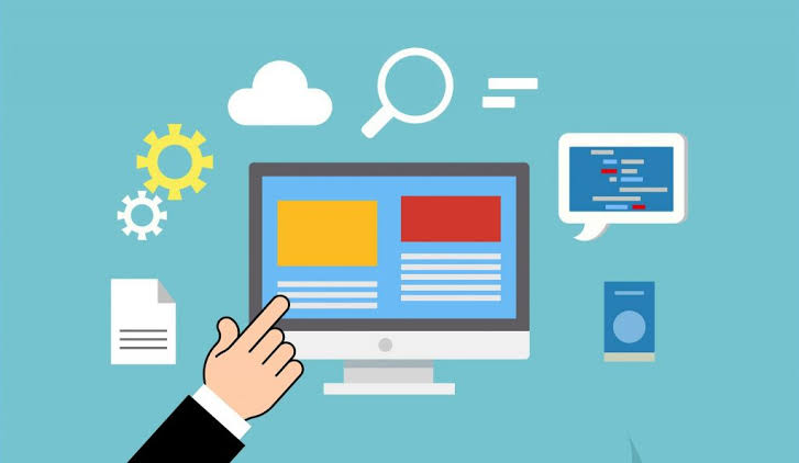
That aside, our area of focus is the significance of web design for a B2B portal. Even though the visual appeal of your business site speaks a lot, a B2B website is not all about a lavish and creative abstract. This does not mean it should not be attractive, but capture the attention of customers while at the same time making it easy for them to find the information they need. Here are 4 traits that make a B2B web design successful.
Prioritize User Experience
One of the main reasons why you need to have a B2B portal is educate your clients. To achieve success, you must prioritize user experience more than anything else. So determine how much content is needed on your website and how well you can structure it. In order to determine the content required on your site, it would be better to work with Marketeers as they have what it takes to guarantee satisfaction. As for the structure, outsource it to designers and they will be ready to offer a helping hand.
A professional web design is not all about the visual part but also the layout, structure and experience of visitors. Users should have easy time finding information regarding your organization together with beneficial information such as documentation, pricing, features and so on. Of course, this needs to be done in a manner that allows swift flow of information. Some might wonder how this works. To offer a helping hand, strive to create a simple and clean website using the best web design templates and everything will work perfectly.
First Impression Matters
Let us face it, first impressions matter a lot and many people will judge you based on what they see during the introduction process. The way your website is designed lets visitors know what they are destined to acquire from your brand. Have a poorly designed website and no one would be willing to buy anything. Things are not different with B2B websites considering visitors are definitely going to be primed when the first impression is amusing. Therefore, future interactions and purchases are entirely based on it.
Have a Mobile Responsive Website
As the number of people surfing the internet from a Smartphone or tablet continues to rise, you must have a mobile responsive website to stay ahead of your competition. Of course it might take some time for you to redesign your B2B website accordingly, but ignoring it can end up costing you and this is bad for business. Whether it is a B2B, news feed or e-commerce website, if it is responsive, then you are doomed to fail.
With the numerous digital design marketplaces available online, this is something you no longer have to worry about. As a matter of fact, you only have to get the best responsive templates from a reputable marketplace such as Template Monster and you are good to go. Remember, the templates must be 100% responsive in order for users to have an easy time.
Boost Call-to-Actions
Relying on your site as a source of lead generation is one of the most important things you need to try. However, the design of your website makes the difference since it ought to properly stipulate the primary CTA. In addition, users need to understand their end goals not forgetting what you want them to achieve.
Most B2B website owners focus entirely on primary CTA’s and forget about the secondary ones including view case study. Doing this is never going to help them with anything as they cannot look into the needs of visitors who are yet to convert. For you to foster prospects towards end results, focus on secondary CTA’s and guarantee a swift website flow.
Every B2B website should focus on lead generation even though the buying decisions may take about 6 months to 2 years to complete. Actually, this is why you need to have a “sales-ready web design” to sustain a length sales cycle. To cut the long story short, you B2B web design should focus on:
Highlighting the goals of your buyers
Organically generating high-quality leads
Persuading leads to take the sales funnel route without any help
When your website is up and running, you should never forget to check the page layouts, videos, photos and so on. If you cannot achieve this single-handedly, simply get help from experts. After all, you do not want to make that will cost you in the long run.
Web design will go a long way in making sure you create a good first impression, credibility and build trust. To make it even better, you can direct prospects in the right direction thus initiating a conversation. Just as is the case with e-commerce templates, you need to employ the best themes in order to give your B2B site the identity it deserves. Never be in a hurry to launch your website by grabbing any template you come across and moving on to the next step. Instead take your time and determine what works better for you.


